
After the UK government halted the lifting of lockdown with a screech of brakes, because of an increased number of cases over the last month, I’ve taken a closer interest in the official stats. It’s better than reading endless e-mails about the exact meaning of the regulations on wearing facemasks in church, but leaves me equally bemused.
There has indeed been a gentle rise in the number of “COVID positive tests,” which looks worrying. Some say the dreaded “R-number” has exceeded 1:
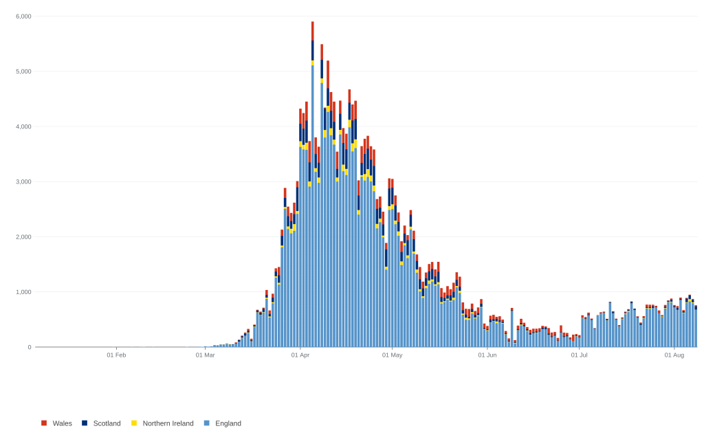
But this, as a number of others both here and in the US have pointed out, means virtually nothing because of the number of uncontrolled variables: increasing testing, changing sampling systems and distribution, the non-specificity of the tests, and their probable ability to detect virus fragments some time after the patient has cleared the infection. The last means that the more complete our herd immunity, and hence safety, the more likely we are to see increasing cases.
Many epidemiologists have said that the only really valuable figure is the death rate, but this too is complicated by the policy of including all who have died at any time after a positive COVID test as “COVID deaths.” Not only does this drag in those like comedian Bobby Ball, who died at the height of the epidemic from terminal cardiac failure and happened to test positive for COVID. But it also includes an unknown number who die from entirely unrelated causes, like the guy in America who was struck by lightning on a ladder, suffering horrendous and mortal injuries, but tested positive for COVID on his admission and was included in the figures. I’ll have more to say about that shortly, but note that the government site points out the policy of including all patients who have died with a positive COVID test in the figures.
Nevertheless, even if we take the fatalities at face value, the mortality in the UK population is just 7 people per 10,000 of the population, and of course 80%+ of those were in the 80+ age bracket, many of whom would have succumbed to winter infections this year anyway. Given that a new UK study has shown that for every three COVID deaths, a further two have been caused by lockdown – and that’s before we begin to reap the predictable mortality due to the coming recession – lockdown has been an unmitigated medical disaster, as I predicted in March. Lockdown has simply served to show the stupidity of relying on un-validated models for prediction, but also the questionable rationality of the government and its scientific advisers for defending the policy and even sticking with it as we move forward.
In this regard, it is now clear that cases peaked before lockdown, and so even without counter-examples like Sweden the gloomy projections of half a million deaths here were no better, and possibly worse, than reading the omens of a sheep would have been. Astoundingly, HMG still appear to be using those failed models for predicting a terrible second wave. Neither the press nor politicians are demanding explanations for this, though plenty of social media from people who are asking have been censored.
Note to Boris: every model is wrong, but some are useful. Those which make erroneous predictions an order of magnitude too great in every country they have been adopted are not useful, and should be dropped like a hot brick.
But let’s look more closely at this second wave, ie the increase in case numbers that has precipitated quarantines that have ruined people’s holidays, and the holiday industry’s livelihoods, and bans on live music that have kicked an industry already on the ground, not to mention the imposition of face muzzles by law and with little clear evidence of benefit. Oh yes, and the threat that we can’t re-open our schools unless pubs and shops (and churches?) close.
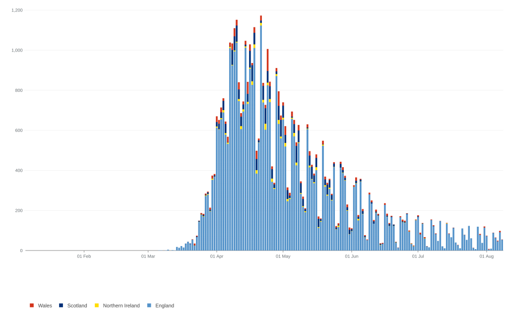
What is immediately obvious from the stats is that, despite the slight case increase having lasted over seven weeks (with a suspiciously sudden start), hospital admissions have continued to decline, on some days to single figures.
Now, given the anomalies in death records (including the impropriety of using “excess deaths,” as is done for flu deaths, because lockdown has added so many deaths on its own account), admissions for COVID are our best guide to the real situation: serious COVID-type symptoms in mid-summer are highly likely to be due to that cause.
But the continuous decline in admissions is inconsistent with a “second spike” of the same disease, since the criteria for admission have not changed, and likely fewer people are being left to die in care homes after the adverse publicity. It seems likely that if you get ill now, you will get admitted and numbered in the stats.
So fewer admissions must mean either that the virus has lost its virulence and is now working more like a vaccination program, in which case we should relax, not tighten, restrictions; or that, as many have suspected, the increased positives (largely in asymptomatic patients) have been caused by anomalies of testing, as I have discussed already.
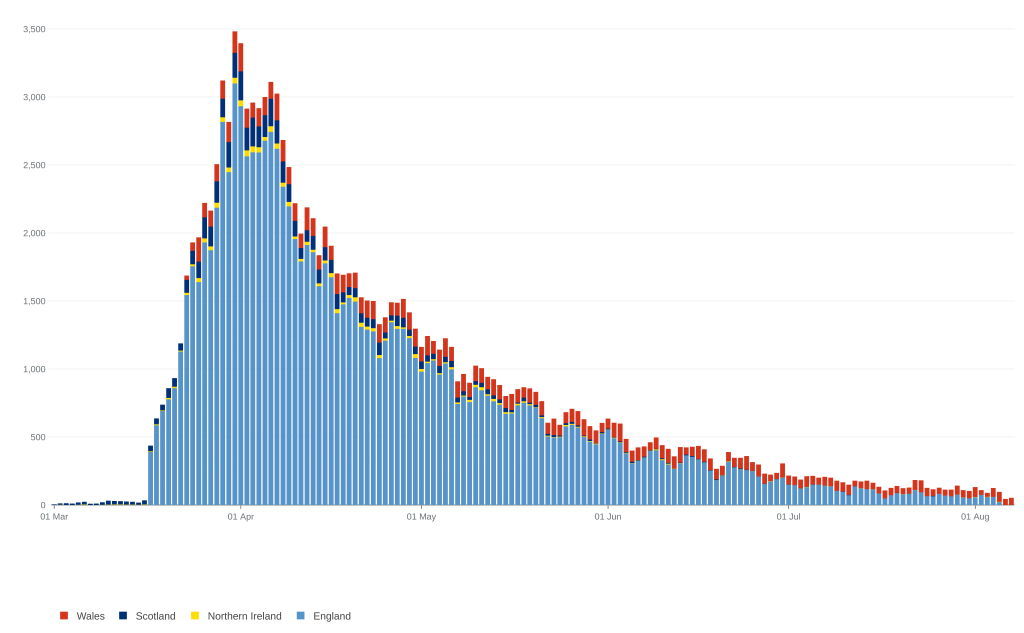
But the other interesting observation from the data is that, whilst deaths have been dropping, as well as hospital admissions, they don’t appear to be dropping as quickly as the admissions. And that does not compute, because we have learned a lot about treatment, ventilator figures are down, and so we ought to see a lower proportion of deaths to admissions.
I’ve done some crude calculations, by totalling the admissions in England for each month from April 1, and the monthly deaths dated from a fortnight later (around the average time from admission to death). The percentage of admissions dying at the height of the epidemic in April and May was 33% and 34%, respectively. Total cases by June had already dropped dramatically (only 9,159 admissions compared to 54,145 in April), and the death rate also dropped a little, to 31%, as one might expect from more refined treatment and, perhaps, less pressure in the ITUs.
But the figures for the last full month, July, show that although there were only 3,058 admissions, there was a dramatic rise to a 55% mortality. Indeed, over the last week or so (admitting that the stats may come under revision later) there appear to have actually been more deaths than admissions, which is absurd.
Somebody with more application than me might do well to reckon the figures at a finer grain, perhaps using weekly figures, but it seems to me that the only plausible explanation is that a very high proportion of the current death figures are actually deaths from late, unrelated causes in people who, at some earlier time during the outbreak, have tested positive. Given the age distribution of the disease, this would mean that the 90% of elderly patients who survive the infection without major problems are, as one would expect, beginning to die from the usual causes of old age: heart attacks, strokes, cancer, dementia and so on.
Previous COVID infection would be more or less irrelevant to their deaths, and the implication is that the total number of deaths attributed to COVID-19 has been, and is increasingly, exaggerated. As time goes by, the COVID death figures will increase because more of the population will have survived infection by the virus (generating apocalyptic headlines, perhaps?) even as the outbreak dies away. At the same time, the way the stats are presented will increasingly downplay the non-COVID deaths precipitated by lockdown, simply by invoking a positive COVID test at any time in the past.
In other words, because of how they are counted both case numbers and deaths give a false impression of ongoing COVID problems: only hospital admissions are indicating the true picture, and that is of steady decline.
So to reflect reality we have to revise that 0.07% population mortality downwards, perhaps to 0.05% or less.
The disparity between seriousness and the political (and scientific) response is even greater when compared to previous pandemics. I mentioned back in March that the Hong Kong Flu of 1968-9 killed 80,000 in Britain, many of them young people. But the population then was only 55 million, giving a population mortality rate of 0.15%, or double that assumed of COVID-19, as well as an actual number of deaths nearly double our present one – which is worse than much of the rest of the world.
COVID-19 is scarcely the Black Death, then, where the mortality was nearly 50%, or even in the league of Spanish Flu, with a mortality ten times that of COVID. Despite that, our collective response has trashed the world economy and disrupted life more than any epidemic since the Black Death.
I understand that Frank Borman developed Hong Kong Flu whilst on the Apollo 8 Mission around the Moon, apparently catching it from Lyndon B. Johnson, the ex-President. That surely cries out for the kind of comparison often heard when our society louses up – “We put a man round the moon with Hong Kong Flu, so why can’t we have a normal church service during COVID?”
Answers on a postcard, please.
I should have added that various pronouncements from SAGE members suggest that the aim of government policy is to eradicate COVID-19 from the country. If so, we need a revolution to remove the lunatics from power – anybody with any scientific knowledge should surely realize it’s impossible to eradicate viruses, the sole exception being the rather unusual smallpox virus. Certainly one isn’t going to do so by restricting the natural liberties of your citizens.
On reflection it rather sounds rather like the idea that a reboot of society will eradicate racism, the only tools available being the polarising critical race theory combined with silencing dissent by all means possible. But then, there seem to be plenty of voices in high places calling for that too.
Excellent post, Jon.
I think you have summarised ‘what is known’ very well.
The scare quotes because evidently the politicians either don’t know what is known or don’t want the plebeians to know.
Recently I have read some reports about the previously underestimated cardiovascular effects of COVID-19.
Here’s one: https://www.dicardiology.com/article/cardiovascular-impact-covid-19
Perhaps many of the delayed deaths will be due to cardiovascular complications (in folk who, as you have suggested, would have eventually succumbed to them anyway).
Thanks Peter. The biggest mystery is why there is so little discussion of the rather basic metrics I looked at. The best explanation seems to be Groupthink amongst the closed circle of “favoured experts” and/or innumeracy amongst politicians. Added to suppression of alternative interpretations of data.
The question of “funny complications” in other than already sick patients is likely to be relatively uncommon, I suspect. After all, you’ll have had a reasonable number of patients during your GP career getting post-viral syndrome to varying degrees after flu and other common viruses, but if it were a very common feature, it would be part of the description rather than a thing whose very existence was often disputed.
Apparently the early fears about Kawasaki syndrome in kids with COVID have turned out to be unfounded or exaggerated, so some of these complications may even turn out not to be real. Such things always lurk in the small print, whereas with Royal Free Disease (Encephalitis lethargica) I believe the mystery symptoms more or less were the pandemic.
I think I may also have mentioned in another post the observation that TOTAL excess deaths this year are below average in several countries post-COVID. That suggests the pandemic hit those who were already extremely vulnerable because of low flue-rates for the previous 2 years, and also that this “once in a century” global pandemic hasn’t actually made that much impact on the annual pattern of deaths.
Jon, you and I both know that statistics are one step worse than “damned lies”. Here in New Zealand the government is claiming success in eliminating the virus through their policies, but I think this was possible mainly through Jurisdiction rather than Jacinda. We have to credit a thousand miles of stormy Tasman Sea for our viral freedom but even now Covid is battering the defenses at our international airports. It is ironic that the industries that were responsible for distributing the virus world-wide are now crying foul when they were battened down to control this spread.
Having said that Kiwis have become extremely protective of our freedom and are very thankful of the earlier rather unpopular measures taken in lockdown.
Hi Stuart
Indeed NZ’s success so far seems to be a lot to do with geography. The problem now seems to be whether it’s realistic to seek to reproduce the Maoris’ complete separation from the rest of the world until the virus no longer exists, given COVID’s ability – like all viruses – to transcend immigration controls.
In other words, it may prove risky living without herd immunity. Nevertheless I envy you the current freedoms – make the most of them!
Brazil is currently the nation to vilify, but its curve is, like other southern-hemisphere countries, following the winter season in a similar way to how northern nations did 6 months ago, and the deaths per million are not yet at, but seem likely to equal, those in other countries. It looks as though it’s reaching its peak just now, but certainly it’s too early to say the pattern will end up any different from the usual quick peak, slow tail pattern.
Stuart
4 cases in a family in Auckland today shows NZ’s ongoing vulnerability, wherever the infections came from. Your government feels more constrained than ever to impose restrictions on everybody again, lest the cat gets out of the bag.
It’s easy to see that such a situation must prevail as long as the virus exists in the whole world… which means permanently. How can one plan anything when arbitrary restrictions of your activities are likely to result from one person at the other end of the country getting ill with an endemic virus?
That said, it’s not a lot better in countries like Britain, unless somebody in power decides to think realistically about risk. We are now officially in real recession, far bigger than the 2008 crash, caused by continuing restrictions based on algorithmic projections (deaths and admissions continue to fall); kids exam results are equally unreal, based on another set of cobbled together algorithms. Churches are meeting virtually and unable (often unwilling) to address the loss of civil liberties necessary to preach the gospel.
Plus, at the same time, speech is unreal because nobody is permitted to say what they really think.
Yes, the only useful (but probably unattainable) statistic is deaths per week, for all causes, over time. If deaths from old age go down as deaths from COVID go up, that would be fairly QED.
Ben: Agree, although certainly in many countries, “Old Age” is not an acceptable primary designation on death certificates. Nevertheless, combining primary diagnosis with age would give a pretty reasonable idea of what’s going on.
yes I still say its been a humbug of stats. Possibly the great number of people confuses everything. maybe it should be 99.9% verses 99,76% about getting it. 1% of 1% of the pop is the same as nothing even if its something. If the black death had these stats for its first year it would not be that black. they have been killing a fly with a grenade.
Update: HMG has belatedly decided to include as “COVID deaths” only those within 28 days of diagnosis. This is still a crude measure, but reduces the total deaths very considerably, by around 11%. That gives a national mortality of 0.06%, or 6 in 10,000, or around 1 in 1700.
A second wave as bad as that and we’re stuffed!
They’ve now re-posted a revised “deaths” page, and the graph based on deaths before 28 days after diagnosis more or less disposes of the anomaly between “admissions” and “deaths.” In other words, deaths are continuing to fall, even as “positive cases” continues to rise.
If the latter bears any true relationship to infections, then it is clear that the virus has become less virulent. More likely, the stats for cases are meaningless, and there’s no second spike. There will certainly be some real increase when it gets cold again, but nothing in the worldwide data suggests it will be as bad as the first.
Jon,
Really good post. Currently, in my part of the U.S. we are seeing a decline in positive tests, hospitalizations, and deaths. So much oddity with this thing. A large state college here recently tested students. The first 30,000 had an infection rate of less than 1%, .83. Now, this is great but leaves me a bit confused. There have been accounts in this state that some people who went for tests, got frustrated with the lengthy wait and left without a test, only to receive positive test results. A friend of mine knows a couple of people this happened to, and there have been reports of this from around the region. It seems someone really wants positive test results. Yet, not the case with these college tests. Don’t know what it means, just interesting.
Elizabeth
My problem with policy is that, apart from the difficulty of equating “positive tests” with “numbers of cases,” it’s hard to identify what the various governments’ aims are.
If there are lots of cases but few deaths, that ought to be great, as it means herd immunity is building up in advance of the fabled “second wave,” but all the talk is of “preventing the spread.”
If it’s preventing the second wave itself, they’re failing because cases are rising. But nobody has really explained how they know that increased winter cases would suddenly cause an increase in serious complications and deaths.
You’d have thought there is an overwhelming case for getting society and the economy back up and running so we can face whatever the winter throws at us later (if anything).
More local news: my county of East Devon has had one case in the last week, and the whole of Devon has had one death in that time.
Devon is a tourist destination, and has had double the usual number of visitors because of release from lockdown, and lack of foreign travel. But there has not been a single case of spread from incoming tourists, or even from shops, all the cases being sporadic and cropping up in households. On the beaches and promenades, everyone’s cheek by jowl without masks.
Logical conclusion: we could afford to cancel all restrictions, at least until there’s a noticeable increase in admissions, rather than chasing the apparently meaningless “R-number.” Currently deaths from COVID in Britain are the lowest in 20 weeks, and constitute 1.7% of all deaths. And I still don’t know anyone personally who’s tested positive!