
I think the data collection is complete enough now to be confident of the trend in COVID-19 positive tests since UK Lockdown #3 began on 5th of January. Here is today’s chart:
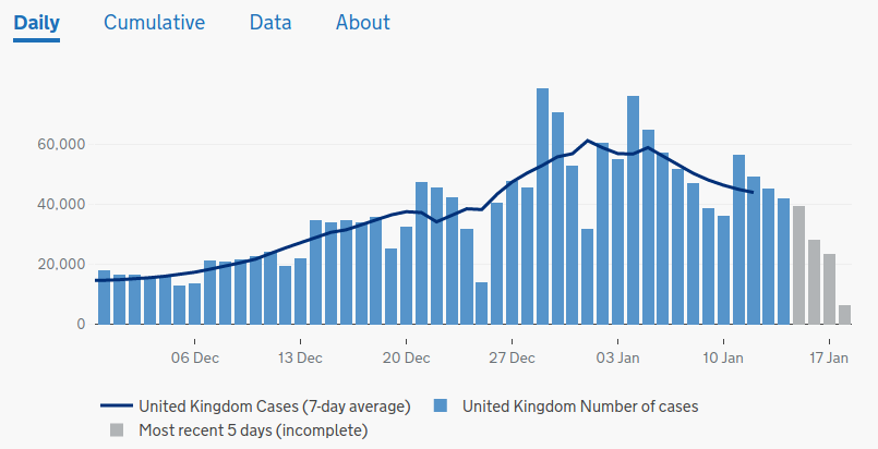
As you see, the national tide is seen to turn, slightly shakily, on 1st January, 4 days before lockdown, though as I explained in my first post on this the maximum in London and the south-east, a significant part of the population, was actually reached on Christmas Eve. If one were to attribute that reversal to anything in the way of population controls, it would have to be the initiation of Tier 3 on 14th December, and not even Tier 4.
The ONS also has a useful chart of cases per 100,000 averaged over the week. This removes the bias of the variable number of tests being done, but tends to blur the effects (or non-effects) of any interventions, since it takes about 6-8 days for new infections to test reliably positive. Here is the latest version of that chart, with my annotations:
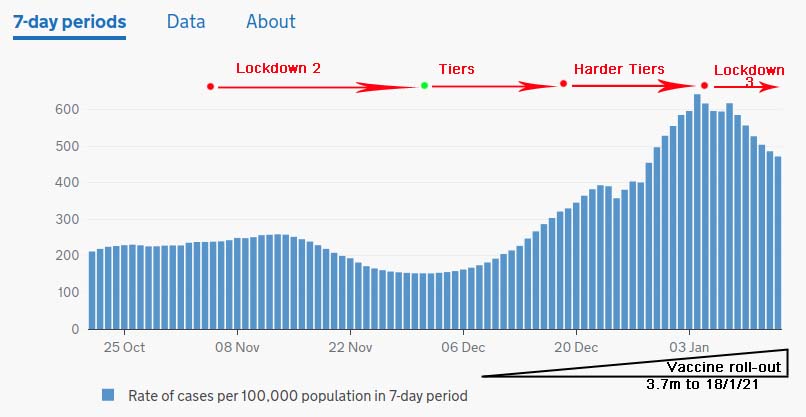
Even taking the smoothed nature of the trace into account, you can see that in Lockdown 2 the upward slope of the graph is unchanged until it peaks at the previous weekly average on 12th November, rather too early to be the result of the lockdown. Less clear is that it began to rise again several days before lockdown ended, giving non-correlation at either end of the intervention.
This being the case, the curve is then smoothly up, and apparently unaffected by the change to the more lenient Tier system. The downward “kink” over Christmas (few tests) disguises the fact that the toughening up of tiers on 19th December didn’t change much either, nationally.
The turn-down occurring over the New Year has by now become a smooth, if somewhat shallow, decrease which, even on the averaged cases/100,000, gets established too soon to be due to lockdown.
I’ve also drawn in the start of the vaccination programme. Since this had only reached 3.7m individuals by 2 days ago, or 5.4% of the population, I don’t think anything much of the improvement can be attributed to that at this stage.
What is apparent from the ONS data is that hospital admissions have probably begun to decline since 9th January, which is roughly in line with the decrease in COVID cases from whatever cause. It’s not only a casedemic then. Deaths have not yet peaked, which is again in line with a genuine reduction in cases – we should expect improvement in the next week or so. However, the data also shows an apparent drop in testing at around the same date (though it is too early to be certain of the trend), which might suggest that the testing of those admitted to hospital may, as I have previously suggested, have been biasing the absolute number of “cases.”
The gloomier of my possible outcomes – that numbers would continue to rise – has fortunately not come to pass. But I predicted the possibility of a fall based on the pattern of winter infection surges in previous years, which often drop in early January. You will recall that I allowed for this as a possible confounding factor, and so it has proved, as the government has taken the credit for imposing lockdown and saving the day.
However, the devil is once more in the detail: the national rise in cases was, very clearly, reversed 4 days before lockdown even began, and there is not even a blip in the raw data to mark a specific lockdown effect around 12th January, when it should have steepened the decline noticeably. In fact, plotting that smooth portion of the curve from 5th Jan onwards to 12th on a log scale shows a straight (exponential) decline, consistent with the natural tail of an infective episode.
I conclude, therefore, that this lockdown has had no more obvious effect on the rate of COVID infections than the first two did, ie nil.
But don’t forget the astronomical costs it incurred, and is still incurring as the government has no plans to relax it until the end of February.
Someone has pointed out a BBC article in which an Imperial College source says that, ONS data notwithstanding, their own much more up to date screening database of 140,000 people shows increasing numbers.
Such a useful and large database is news to me, and doesn’t correlate with any of the separate “pillars” on the ONS site. Does anybody know anything about it, or is it something like the fictional database used in the Lancet article on hydroxychloroquine that had to be retracted?
There’s a good analysis of the November lockdown, including a regional breakdown, here.
Its conclusions are pretty much the same as mine, above, for the January lockdown and my comments elsewhere on Novemer (ie no noticeable effect anywhere).
Further update: The downturn in deaths is now pretty clear, and unless there are any surprises in catch-up data the peak occurred on 15th January. Given the usual estimate of three weeks from infection to death, that precisely matches the peak of “cases” on 1st January, and hence a sharp downturn in infections a week earlier, around Christmas Day.
Once more, neither lockdown nor even Tier 4 imposition on 19th December correlate to those timings.
As my wife was passing on the BBC headline that Chris Whitty says we are now “past the peak” but that cases are still high, I happened to be reading this article showing the peak was passed over a month ago, as my three blogs have shown.
One bit of information I haven’t drawn attention to before is that the same peak occurs at the same time in North America, South Africa, Europe as a whole and (less sharply) in the world and Africa totals. Sweden’s peak was a couple of weeks earlier. Whatever mysterious forces control the waxing and waning of COVID, it clearly isn’t UK restrictions or vaccines.
Not that you’d glean that from Chris Whitty.