
Epidemiology is a complex and often counter-intuitive science, as I discovered on a correspondence on prostate cancer screening with the head of the UK screening service some years ago. In the wrong hands, that can make it dangerous: as someone said, “epidemiology was invented to make economists look good.”
But in assessing serious situations like a pandemic, there are both complex and risky, and simple and effective, tools which may be used to assess interventions.
The most complex and risky is the use of computer models, which as the experience with Imperial College’s model has shown for COVID-19, is highly dependent on ones initial assumptions. If those are overly pessimistic, the models can prove enormously misleading and damaging.
They also suffer from the need to validate them against the real world, which is difficult during a moving crisis. That appears to be one reason people with an agenda like to rely on them: the validation can always await some future date when things settle down. This appears to be as much the the case with COVID as with climate change.
The gold standard of predictive science is, of course, the laboratory experiment, which has the advantage that it is based on real data rather than hypotheticals. For example, a proposed intervention such as face-masks in COVID can be evaluated by laboratory experiments on different types of masks using different techniques.
The difficulties of this are immense, because a laboratory is still, in effect, a model. Measuring the particle size that will be blocked by a mask in a lab will not necessarily tell you about the same mask in a shop. Using experimental subjects breathing, coughing, sneezing or singing into a new mask will not necessarily tell you what an old guy with asthma keeping a months-old mask round his neck except at the till will achieve.
Then again, study design is all-important, and in an emergency authorities will tend to pool studies good and bad – if indeed they don’t ignore or manipulate the science to suit their intended policy anyway.
But as a situation progresses, it’s possible to pursue a much more direct and simple evaluation. If, for example, you believe an intervention will reduce the incidence of an effect, all you need to do is plot the effect and see how it changes with your intervention. For example, here is a graph of UK road casualties. Bear in mind for most of the time it is recordinging decadal totals:
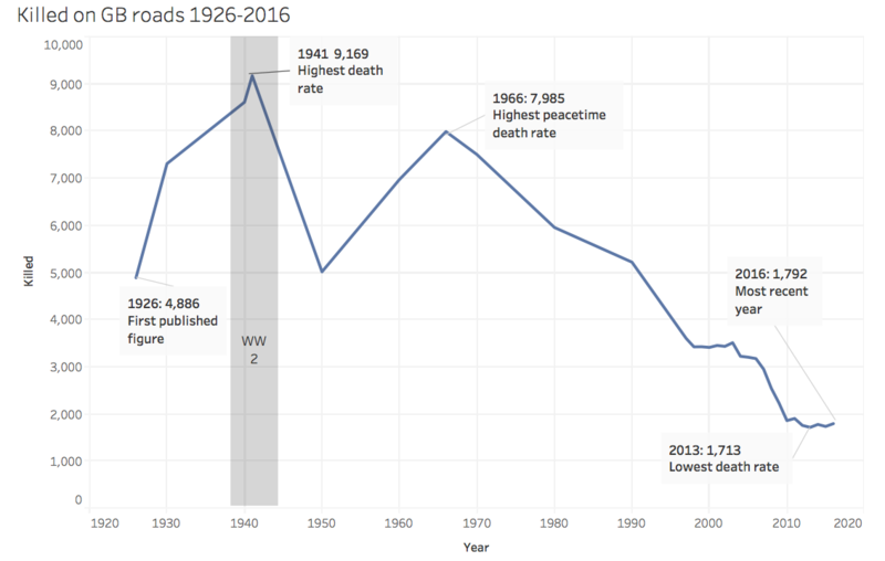
Now, the wearing of front seat belts was made compulsory in 1979. Although the change in the slope of the graph at 1980 is less dramatic than other changes, it should enable us to evaluate the effects of legislation… unfortunately it appears that the rate of improvement actually slowed, but perhaps there were confounding factors. Still, there is a correlation between cause and effect to interpret.
Another example. Here is the measured and projected changes in CO2 emissions caused by lockdowns and reduced activity across the world:
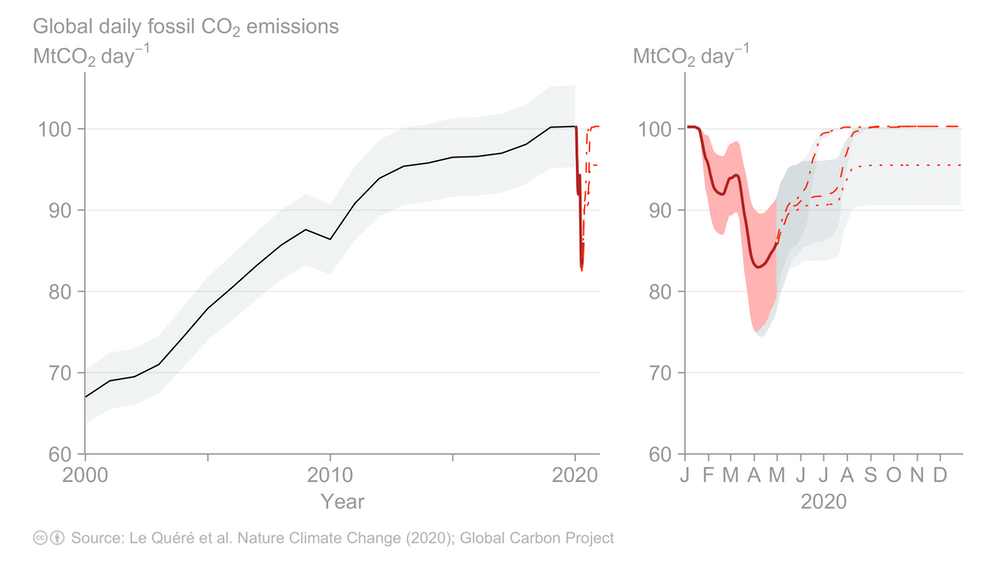
You can see there was a massive drop from January till May, and a projected return to previous, or lower, levels by the end of the summer, around now. We can compare that with the measured levels of atmospheric CO2, which have hitherto been rising (with an annual fluctuation) due, it is said, to increasing human emissions:
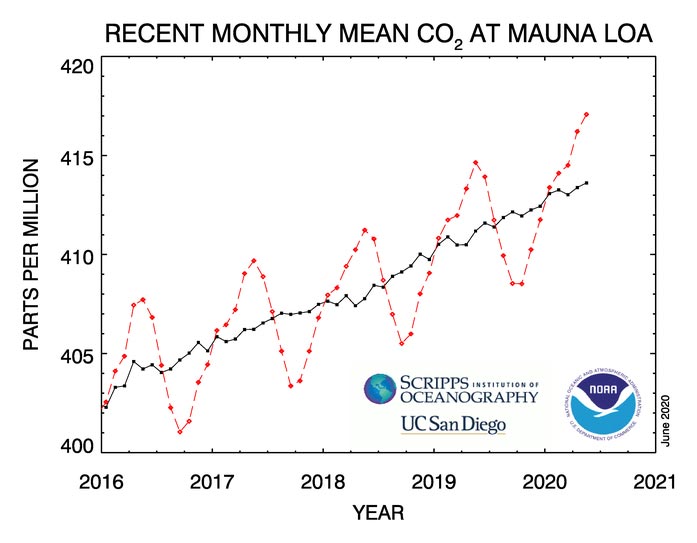
As you see, there is no visible effect, which tells you that things must be more complicated than we thought, or that anthropogenic CO2 is not the cause of the ongoing rise.
COVID, though, is rather simpler in the sense that interventions have been made with the specific aim of reducing the number of new cases, as defined by PCR testing. The figures for this do not go back as far as the start of lockdown, but here they are, from the government website:
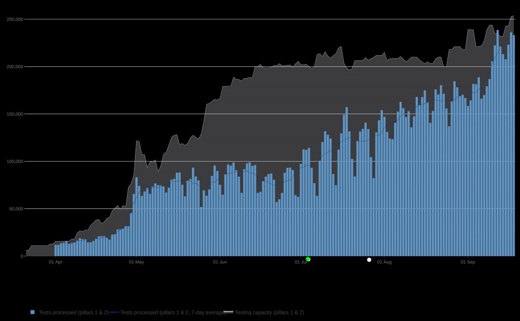
I have marked two significant interventions on the graph. The green one is the relaxation of lockdown, which many are blaming for the rise in cases, as feckless holidaymakers and teenagers started misbehaving. But as you can see, the epidemic cases had bottomed out maybe 10 days before lockdown ended, and the plot thereafter is roughly straight. Stopping lockdown therefore didn’t affect the infection rate either way, and by implication it is probable that lockdown didn’t either.
The white dot is the legal imposition of facemasks in shops, public transport etc. If I had not placed the dot, and we played a version of pin the tail on the donkey, nobody would have been able to guess the date from the effect, unless they had mistakenly labelled the high peak the week before.
This would appear a simple matter – mask wearing, whatever laboratory evidence does or does not show, has made no difference whatsoever in the real world. I think exactly the same non-correlation may be seen in every other country which introduced compulsory mask-wearing at some point. Clearly we can safely abandon the wearing of masks in public situations forthwith.
So as you see, some really reliable types of science can be done simply, because retrospection is easy, as compared to prediction (especially about the future – Yogi Berra). What is more difficult is getting politicians and government scientists to understand simple stuff.
Last Friday, Matt Hancock insisted in a radio interview that “1% false positives” means that 1% of positive results are false. And with that I rest my case that the donkeys on which we are pinning the tails arein government passing the nonsensical laws.